A Color Psychology Guide For Brand Strategists, Designers, and Marketers
Every time you come across a product, you are witnessing a design that has been painstakingly created to influence your mood, emotions, and intent. The high-stake features involved in these decisions include three: colors, shapes, and fonts.
Of the three, colors have been proven as the most impactful and influential. Almost 62-90 percent of assessments regarding a product are based on colors alone. The impact is so decisive and so subtle that even a slight change in tint and shade can alter our emotions associated with the color. Make the orange too bright, and it has a searing effect on the brain. But keep it rich, and it makes you think of honey and warm autumns.
This relationship between colors and their associated meanings and effects on emotions are part of a rich and sprawling field of study: color psychology.
Brand leaders, since the golden age of advertisement, have used color psychology to help them choose colors for their products and designs that give the best results. Depending on the goals of the brand, these results could be a higher rate of brand recognition, more conversions, or even a better brand perception.
What is Color Psychology?
Color psychology is the study of how colors impact human behavior. There is a wealth of data supporting the findings that certain colors make us feel certain emotions. Or there are certain meanings that we associate with particular colors. These meanings, connotations, and influences vary across cultures, genders, history, religions, and much more.
For example, while we in the West think of white as a bridal color, signaling purity and new beginnings, those in South Asian countries like India associate white with death and mourning.
These subjective differences notwithstanding, a lot of color associations are universal. Blue, for example, is generally a favorite color across genders and cultures because it has a calming and relaxing effect. Red is another color that’s usually associated with passion, energy, and love. People in ancient Egypt, Maya, and Rome used it as a celebratory color and the association has transcended history and region. People in modern US, France, China, and many other countries, too, use red to celebrate their joys, communicate love, and express excitement.
Therefore, to create a logo design that represents a loud, playful, and active brand, red is often used as an ideal choice. Blue, on the other hand, is a more suitable color for a logo that wants to reflect authority, trust, and dependability.
Marketers and designers rely heavily on color psychology to inform their business decisions. Every logo design, website design, product design, and marketing campaign draws inspiration from color associations to create final designs that fit the context, and are appropriate for the message or the product being sold.
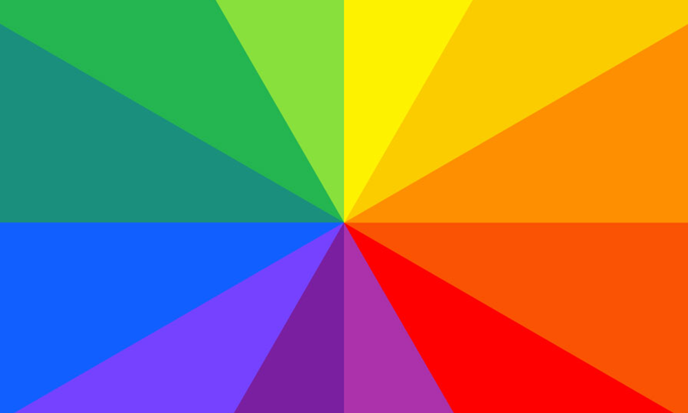
The Color Wheel
This is the most valuable asset to have with you as you explore the dimension of color psychology. The color wheel will allow you to pick, choose, and mix colors that best represent your message.
The color wheel was originally invented by Isaac Newton. He discovered that by refracting sunlight onto a wall, the light split into seven (7) different colors: red, violet, indigo, blue, green, yellow, and orange.

He arranged those colors onto a disc, and the color wheel was born. Modern interpretations of the wheel divide the sections into more than seven — some have 12, and others have even more.
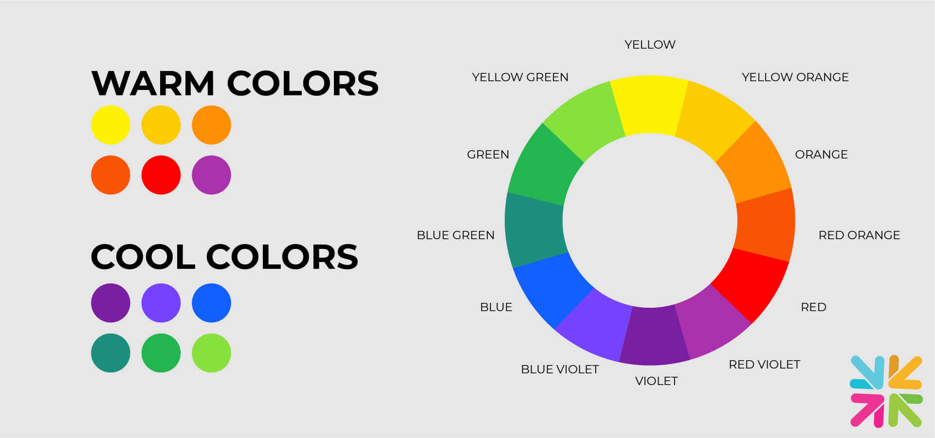
Yet the working principle is the same. The wheel is divided into two main categories of color: warm and cool.
T Red, orange, and yellow are warm colors. While blue, green, and violet are cool.
When mixing and selecting colors for your brand, switching between temperatures, hues, and shades allow you to create the most meaningful and purpose-driven color palette.
The Color Theory Cypher
There is an entire lexicon to get familiar with when working with color psychology. Some of the major terms that you’ll come across are listed here.
.Primary Colors

Primary colors also referred to as the original colors, are red, blue, and yellow. They are pure colors and cannot be generated through other colors. Yet, when mixed and matched with each other in different amounts, they beget a whole new set of colors, called secondary colors. An important thing to remember here is that colors that are considered ‘primary’ or ‘original’ depend a lot on the context or the medium that you are working with.
For example:
- Primary colors for digital screens and monitors are RGB: red, green, and blue.
- For print and paint medium, CMYK is considered as primary colors and includes cyan, magenta, yellow, and key (black).
Choosing the right color model is crucial as you go from one medium to the next to ensure consistency of color pigmentation and quality across brand and marketing materials.
Secondary Colors

Secondary colors include purple, green, and orange. They are created by mixing two primary colors together.
- Red + Blue = Purple
- Red + Yellow = Orange
- Blue + Yellow = Green
On the color wheel, you can find secondary colors wedged between two primary colors.
Tertiary Colors

This is another set of colors on the wheel — a step further than the second layer — and is achieved by combining primary and secondary colors together. This gives these colors their compound names, such as blue-green, red-orange, yellow-green, and so on.
There are a total of 6 tertiary colors on the color wheel.
HUES

Hues are referred to as pure colors. Without the addition of light, dark, or any other color added to them,
they are the most saturated, intense colors on the wheel.
A pure hue could refer to a primary color, secondary, or even tertiary. The deal is not to add anything more
to it and keep the pigment pure.
TINTS

These are hues with white color added to them. They lighten the color and give us pastel tones that are mostly used in design identities related to wellness and spa logos, feminine brands, daycare centers, and other fun, child-related brands.
SHADES

Shades are pure colors with black added to the mix. They darken the color and make the effect more serious. Shades are needed to dull the brightness of the actual color and add more depth to the design.
TONES

Tones are pure color with hints of gray. The amount of gray decides how deep the tone will be. Tones are also used to bring down the brightness of the pure color but unlike shades, tones keep some of the light and keep the color cheerful.
6 Common Color Schemes and Their Uses
Now that you know the basic vocabulary of color psychology, it’s time to study how color palettes are created.
Color palettes — also called color schemes — are one of the most important elements of any brand identity. A lot of time and effort is invested in creating a compelling color palette that’s right on point for the brand and everything the brand wants to say.
Color palettes refer to sets of colors that each brand uses for its identification and differentiation. The color palette for Levi’s is markedly different than that of Netflix, though both use red as the main color. The differences are not only in the different kinds of reds that are used but also in how each red conveys a unique meaning.
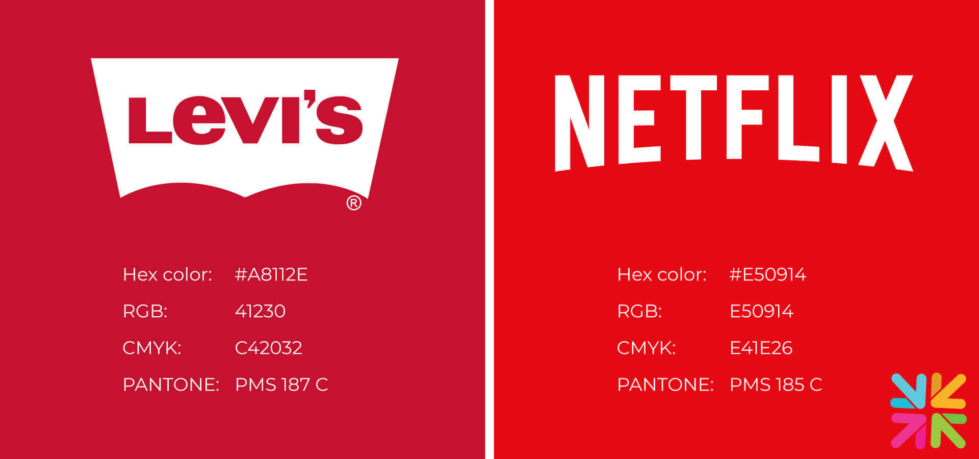
- Levi’s red is blithe, strong, and rich
- Netflix red is prominent, dazzling, and dramatic.
In every color palette you create, one or two colors will be used as the primary (main colors) while the rest will be secondary (accent).
Below are 6 common ways designers use the color wheel to determine the basics of every color scheme they produce.
1. Monochromatic

A monochromatic theme uses different tints, tones, and shades of the same color and thus produces a cohesive, very streamlined effect. It is the safest, most pleasant, and most harmonious-looking choice.

If you are a new designer, consider a monochromatic theme for your first couple of projects because it will give you the best practice of achieving a balance between variations of color, without a lot of potential for mistakes.
2. Complementary

Colors that sit opposite to each other on the color wheel are called complementary colors. Think of red/green, blue/orange, and violet/yellow.

While any two opposing colors can be termed as complementary, the title often refers to pairings of primary and secondary colors. Because these colors are so opposite of each other, they also give the highest amount of contrast when paired together.
Contrasting colors are pleasing to the eye and even aid in reading. Black and white are probably the most popular contrasting color pair there is.
3. Analogous

Analogous colors sit next to each other on the color wheel. As a result, they share a lot of similarities. They usually have the same temperature and very similar effects on people’s moods and emotions.
Take red, red-orange, and orange, for example.

All three colors are warm and incite positive feelings of joy, excitement, and celebration. Plus, as a color scheme, it gives you a well-balanced palette that is more exciting to look at than a monochromatic feel but without the glare and look-at-me attention of a complementary palette.
It’s easy to create an analogous scheme. Start with a primary color and choose its next two colors from the secondary or tertiary level as accents. Usually, an analogous scheme consists of three colors, but you can choose up to 5 without muddying your color palette.
4. Triadic

Color schemes that are derived from colors that are equidistant to each other on the wheel are called triadic schemes. They create the perfect triangle when you spot them at the wheel. If you are looking for words to describe a triadic theme, look for bold, powerful, jubilant, and devil-may-care.

That’s because these schemes have more color variety in them as the temperature and hues are different. They are more contrasting than analogous or monochromatic themes, too. For this reason, you have to be careful with triadic colors. Use them gently with one acting as a dominant shade and the other two playing a supporting role.
5. Split-Complementary

In this theme, you take the complementary one step ahead but make the contrast less intense. How so? You pick a color plus two on either side of its complementary color. Since you are not choosing direct contrasts, the resultant color scheme is less harsh and more balanced.

For the best effect, choose your main color from the primary hues while the two complementary colors can be from the secondary compartment. It will give you a well-balanced theme without the shock effect. Plus, again as someone new dappling in color psychology, the theme is easy to manage.
6. Tetradic/Double-Complementary

As a designer or even a marketer, you’ll soon learn that minimal color palettes, while great in theory, can be quite limiting when you have to get a layered message across.
For some designs and some marketing campaigns, you do need a variety of colors. Tetradic themes come in really handy then. A tetradic color palette is based on 4 main colors — creating a rectangle (or a giant, lean X) on the color wheel.

As you can imagine, it’s not for the faint of heart or those new in design as balancing such strong-willed colors can be quite challenging. But for an experienced designer, tetradic themes or double-complementary colors are the stuff of dreams.
Famous business logo designs like Microsoft and eBay are further examples of tetradic colors done brilliantly
Why is Color Psychology Important?
Now that we’ve cleared the basics of color psychology, let’s progress to the valuable role it plays in effective branding and marketing. We’re going to briefly look at different areas of branding/marketing and rely on statistics to show you the crucial impact of color.
In case you are confused about finding the best tool, you can go through a few others to get an idea of their features. Make sure that you check the customization options for the colors, shapes and fonts and then choose the one which has more to offer.
-
Brand recognition:
-
Brand perception:
-
Brand memorability:
-
Product assessment:
-
Conversions:
Colors help us identify our favorite brands and pick them from a sea of designs when we go to a grocery store or a shopping mall.
When correct colors are chosen for product packaging or other areas of branding, brand recognition can improve by up to as much as 80%.
Colors also play a key role in improving people’s perception of brands. Context-appropriate colors matter the most here. If the colors you choose are appropriate for the product you’re selling or the market that you’re selling to, your brand appears more confident, and more in control.
It has been a long-established fact that colors aid memory. When we have presented information in color compared to black/white, our brain processes it faster and better.
With that in mind, when creating marketing campaigns, relying on the use of colors can help with brand communications. Colorful infographics, appealing CTAs, and branded videos can all aid in sending specific brand messages.
Consumers rely on colors or products and packaging when making functional assessments about products, a study has revealed. According to a research article published in the journal Psychology & Marketing, consumers perceive darker-colored products as more durable and long-lasting than the same products in lighter colors.
Colors have a direct impact on how consumers make purchase decisions. When Performable changed the color of its CTA button from green to red, the conversion rates jumped to 21%.
How Brands are using Color Psychology To Stand Out
Identification and distinction are two very important areas in marketing.
- You want people to identify your brand.
- You want people to distinguish your brand from the rest.
Colors help you achieve both of these goals.
In this section, let’s take a look at the 10 main colors and see the brands that are benefitting from all the positive associations we carry with these colors.
1. Blue

Blue is often considered a universal favorite that transcends gender, culture, and subjective differences. On one end, blue is considered calm, relaxed, and tranquil, but take it to the extreme and it's also the color of sadness and melancholy.
General emotions associated with blue:
- Trust, confidence, wide spaces, stability, and freedom.
Industries that mostly use blue in their branding:
- Technology, finance, medicine, and such.
On the whole, it’s a calm and reliable color and gives you a solid base for all your color themes whether you are designing a business consulting logo, community logo, or aviation logo.
2. Green

Green is the color of harmony, health, and hope. In branding and marketing, green is famously associated with eco-friendly initiatives, organic foods, and nature-based projects. It’s a fresh color that embodies generosity, growth, and revitalization.
General emotions associated with green:
- Prosperity, wealth, abundance, safety, and luck.
Industries that mostly use green in their branding:
- Food, beauty, body-positivity, wealth management, and such.
Since green is a mix of blue and yellow, it combines qualities of trust and calmness with the hope of brighter and happier days ahead and is often used in insurance logo designs.
3. Red

Red is a powerful primary color. It’s sexy, bold, passionate, and unafraid to be bold. It's a color that demands attention and entices us to take action like no other. It stimulates, encourages, and energizes.
General emotions associated with red:
- Passion, energy, sexuality, strength, and courage.
Industries that mostly use red in their branding:
- Food, art and media, retail, technology, and such.
When you are designing action-oriented marketing such as creating a fitness logo for a gym, or when choosing colors for functional elements such as CTAs, go with an action-packed color such as red.
4. Yellow

Yellow is a fun color, filled to the brim with hope and optimism. It’s also a warm color like red, and inspires you to take action, but without being overbearing. It's a happy color of sun-filled days, summer walks, and light filtering through the windows.
General emotions associated with yellow:
- Warmth, hope, energy, enthusiasm, and creativity.
Industries that mostly use yellow in their branding:
- Construction, logistics, food, media, and such.
Because it can be quite a brightening color, it’s rarely used as a stand-alone shade. It is often accompanied by red for fast-food restaurant logos and by black for construction logo designs.
5. Orange

If you are looking for the perfect balance between energized red and happy yellow, go with the cheerful orange. It's a zesty color that invites attention and action, but it’s not too in-the-face about it. It’s a joyful color that uplifts, inspires hope, and makes you live more spontaneously.
General emotions associated with orange:
- Warmth, positivity, joy, cheer, courage, and creativity.
Industries that mostly use orange in their branding:
- Logos for child-care brands, food and beverage, youth-oriented businesses, and such.
Orange is also associated with thrill and adventure, so it’s ideally placed for business branding when you are marketing to a young audience.
6. Purple

Purple is the ultimate color symbolizing luxury. That’s because back in the day, the dye that gave purple pigmentation cost a lot so only the most affluent could achieve it. As a result, it was the color of royalty and aristocracy.
These associations carry to this day, and purple is popularly associated with wealth, sophistication, luxury, and opulence. Perfect for a jewelry logo design or something equally glittery.
General emotions associated with purple:
- Extravagance, grandeur, mystery, wisdom, and power.
Industries that mostly use purple in their branding:
- Art institutes, luxury brands, beauty, spirituality, and such.
Since purple is a rich and opulent color, do not crowd your space by adding more colors to the palette. Let purple do its magic with a very selective supporting cast.
7. Pink

Pink is a color of feminine-led brands that want to inspire, encourage, and nurture. It’s usually associated with youth and children but has increasingly become a feminist symbol of raw power, compassion, and womanhood. As a color, it’s playful, intuitive, and bursting with romance.
General emotions associated with pink:
- Intuition, good health, love, friendship, acceptance, and approachability.
Industries that mostly use pink in their branding:
- Fashion, beauty, skincare, children's toys, lingerie, food, and such.
Though pink is a sweet color of feminine love, pair it with black to achieve some of the most eye-catching punk rock entertainment logo brandings.
8. White

White is a beautiful and serene color of all things light and purity. It’s a color that signifies vastness, simplicity, and cleanliness. It's a balancing color that brings clarity, provides hope, and clears the clutter.
General emotions associated with white:
- Openness, innocence, perfection, freshness, and calm.
Industries that mostly use white in their branding:
- Medicine, chemical-based cosmetics, technology, and such.
Cleaning services logos entertainment logo also heavily depend on white. It also serves as a common accent color and works as the perfect background in almost all logos, campaigns, and social media templates, etc.
9. Brown

Brown is a color of rugged, raw appeal. It’s the stereotypical masculine color in the spectrum and serves as the color of choice for bachelor pads and hunting lodges. Since brown is also heavily associated with the color of soil and earth, it often relates to feelings of strength, reliability, and comfort.
General emotions associated with brown:
- Honesty, support, wisdom, dependability, and warmth.
Industries that mostly use brown in their branding:
- Furniture companies, agriculture, construction, legal, and such.
Brown is the color of warm caramel, honey, and chocolate, and is often used in Thanksgiving marketing campaigns, as well as in creating manufacturing logo designs to show strength and power.
10. Black

Black is the quintessential color of mystery, allure, and glamor. It’s a color that denotes power, elegance, formality, and seduction. It's a quiet color that can command the entire room without even lifting a finger.
General emotions associated with black:
- Authority, mystery, charm, dominance, and attraction.
Industries that mostly use black in their branding:
- Used for fashion and apparel logos, luxury brands, technology, and such.
Though black is a neutral color like white and brown, it always stands on its own the best and gives your brand all it needs.
Word Associations with Colors
Joe Hallock conducted a survey on how people assign different words and emotions to different colors. The results of his survey produced some interesting findings.
Take a look.
Conclusion
Colors not only serve an aesthetic purpose when used in branding but also have a very functional role to play. They influence customer moods, impact purchase decisions, serve as product assessment tools, and convey subtle subconscious hints.
Marketers and brand designers have been using color psychology — the relationship between colors and the emotions they incite — to send specific messages about who they are as brands and what they represent.
As you become more heavily involved in design-related leadership decisions, knowing the science of color psychology will be an infallible tool to rely on.