
Top Logo Design Trends to Watch Out for in 2024

Logo trends play an important role in developing a company's brand image in a design media landscape that is always changing. Like fashion trends, logo designs also undergo changes every season to remain current and attract consumer attention. With 2024 approaching, design professionals and brand owners must stay informed about the latest logo design trends to differentiate their brands from the competition.
This article discusses the best logo design trends predicted to rule in 2024. Designers can create eye-catching and memorable logos by following the latest trends for their target audiences. Several design styles are popular today, including minimalism, large typography, vibrant colors, and engaging animation. Well, we are not covering everything in the starting, are we? Let's continue reading this detailed guide about top design trends for 2024.
Top Logo Design Trends That Will Dominate in The Year 2024
Here is a complete guide to the top trends of logo designs you can choose from to attract your target audience.
1. The Minimalist Trend Remains Popular
The minimalism concept is not a new one. In the last few years, it has gained popularity across all areas of design, including interior design and web design. Starting in 2014, it became a hot choice for logo designs, and its continued relevance makes it a desirable option for 2024. As a result of minimalism, designs are flat and limited in color, attempting to influence where a potential client or site visitor directs their attention.
It is Apple that pioneered the concept of 'extreme minimalism.' Logos have evolved from elaborate illustrations to the basic logo symbols we are familiar with today. The color scheme has undergone a minimalist transformation from combinations of colors to sleek monochrome.
Take another example of Uber. Uber is a great example of how a wordmark logo can be applied to a minimalist aesthetic. This brand did not use a monogram or symbol as most apps do but instead searched for a simple yet elegant logo font. MCKL Type has become integral to the brand's identity in recent years.
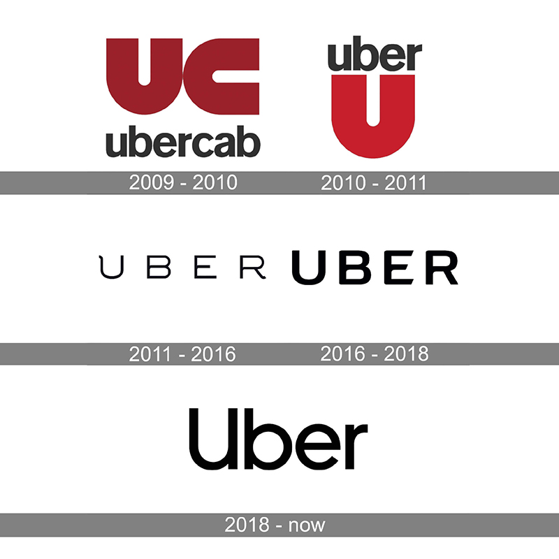
Take another example of Uber. Uber is a great example of how a wordmark logo can be applied to a minimalist aesthetic. This brand did not use a monogram or symbol as most apps do but instead searched for a simple yet elegant logo font. MCKL Type has become integral to the brand's identity in recent years.
Simple minimal logos allows you to produce a design that emphasizes your client's identity and overall message and cuts down on clutter to attract potential customers' attention.
2. A Bold Typeface Makes a Powerful Statement
Using typography in graphic design, and in designing logos in particular, is becoming increasingly important. The year 2024 will mark the beginning of a trend for logos, which make a strong statement through typography.
Hand-drawn fonts, custom lettering, and unusual typefaces are becoming popular designs for logos that are visually striking and capture the viewer's attention. These bold typographic logos convey the brand's identity using powerful and impactful lettering.
One of the modern examples you can look at is the Upfresh logo. It has a bold, red typeface for its logo. The strong contrast between pink and white creates a sense of excitement for people.
Another example is Visa's logo, which features a bold blue typeface with a gold and white design element. The bold lettering shows trust and financial security.
3. A Vibrant Color Palette Dominates The Scene
Choosing the right colors for logo design is important as it can establish an emotional connection with the audience. Colorful logos will see a rise in 2024, with designers experimenting with bold color combinations for a more striking design.
Color combinations with gradients, duotones, and vibrant gradients are a popular way to add depth to logo designs. In addition to commanding attention, these striking color combinations convey a sense of energy and sophistication.
One of the most popular examples that you can look at of this trend is the Google logo, which features primary colors red, blue, green, and yellow, arranged playfully and dynamically. The vibrant colors reflect the company's innovative and diverse nature.
A more recent example is that of Odido’s logo design, Netherland’s largest mobile company. Throughout many industries, 2024 will see a proliferation of vibrant hues in logo designs as designers continue to push the boundaries of color usage in similar manners.
One way to experiment with color palettes is by using an AI logo generator to create your logo and see what you like and what matches your brand identity.
4. Using Geometry and Shapes
It is common to see complex logo designs in 2023 which makes it difficult to impress the audience with this approach. These logos are frequently hard to recall, and the customers may have difficulty connecting the logo image with the company's name. A similar approach may be a major problem for large brands, making it almost impossible for them to build their brand presence and improve their recognition. When this happens, most companies forgo their existing complex logos and adopt simpler logo designs. One way is to select a geometric shape based design.
Geometric shapes such as triangles, squares, dots, and lines can simplify the appearance of a logo. Designers create simple logos with a twist by using bright colors and a high contrast gamma.
Another approach is to use only black and white to achieve the highest degree of minimalism. The aim of all of these approaches is to make the target audience understand the logo image and caption at first glance without losing the image's visual impact, like L’Arche’s new logo.
5. Low-resolution, modern logos with pixel art style
Creating logos using pixel art is an innovative trend that combines low-resolution aesthetics and modern design concepts. Creating a logo in the form of pixel art evokes memories of retro video games and early computer graphics and evokes a sense of nostalgia. Logos such as these differentiate themselves from the high-resolution images that dominate the digital landscape. Gamers may be drawn to logos that incorporate pixelated characters and objects.
In a world of ubiquitous high-resolution pictures, pixel art-style logos offer a fresh and unique appearance. An effective and good logo can be created by incorporating low-resolution aesthetics.
Like, see the new logo of Sound.xyz as shown below.
6. Stacked Text
The minimalist approach of using plain text with a single solid color is popular with web designers, but some find this approach to be tired and overused. Therefore, they stack the text vertically, as this will catch your attention more effectively than horizontally stacked text.
Alternatively, horizontal text can also be paired with this design to create various style options while still maintaining a primary design. In a design that is already simple, it takes on a new and simple approach. As noted, it is not a new trend, but it remains one of our contenders for our list of logo design trends 2024 due to its continued relevance.
Here are a few of the latest examples of such logos.
7. Natural Pattern, Texture and Symbols
In recent years, there has been an increase in public awareness of environmental issues and some brands have started using natural elements like plants, leaves, flowers, insects, etc in their logos to show they are committed to ecological production and their products are services produce less carbon footprint and eco-friendly practices that don’t pollute environment.
Additionally, using such elements can also serve as a good marketing tool to help to attract an audience that strongly believes in global warming.
A study by IBM 2020 indicated that 57% of consumers will change their opinions and buying behaviors to reduce harmful environmental effects.
For instance, look at this one new logo designed for EDP. EDP's image "aligns with its goal of becoming carbon neutral by the end of this decade," it said, adding that its strategic plan calls for investing 24,000 million euros towards the energy transition until 2025. The new logo uses neon greens, blues, and purples to reflect the company's energy transition process.
Some famous brands already use these types of logo designs such as Ecover, a brand of eco-friendly cleaning products, which uses a logo with a water drop shape combined with a green leaf. This design conveys their commitment to environmentally safe cleaning solutions.
8. Enhanced Engagement Through Dynamic Animations
As a result of technological advancements, dynamic animations have been introduced into branding strategies, opening up a new avenue for logo design. An animated logo provides a captivating user experience across digital platforms by bringing movement and interactivity to static visuals.
More brands will utilize animated elements in 2024 to engage audiences and create long-term impressions. Dynamic logos can be enhanced with subtle motion effects like fades, transitions, or complex animations.
9. Incorporating Fluid Lines
The design of logos has shifted towards fluid and organic forms in recent years. Increasingly, brands are adopting aesthetic elements that create an air of elegance, flexibility, and simplicity in their products.
Free-flowing logos are often reminiscent of natural objects. According to the brand's personality, these shapes may contribute a refined or playful touch. Alternatively, fluid lines can be used in logo designs to add movement and dynamism. As well as conveying a sense of progress and energy, they may also evoke a sense of energy.
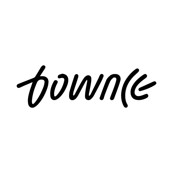
‘Bownce’ is among the latest brands to use fluid lines in its logo, as you can see. The letters ‘C’ and ‘E’ are free-flowing. More companies are predicted to adopt organic shapes and fluid lines to build a deeper connection with their customers in 2024.
10. Using Negative Space in a Logo
Among the logo trends in 2024, negative space logos are expected to be prominent. The concept of negative space is often confusing for some. Whiteness or a suitable color is applied to a specific area in the design to create a shape within the space.
It requires a high level of design expertise to customize a logo image that utilizes white space in this manner. You cannot achieve this by sprinkling colors and leaving blank spaces. To make the negative white space look like a figure/shape or text, you must have a prior structure in mind, defining how you will use colors (or not) in different areas.
Many prominent organizations have used negative space in their logos very creatively, and this trend is not dying any time soon. Some of the popular examples of negative space logos include:
Some Ways designers now use Negative Space:
- Layered Negative Space: Designers use multiple negative space layers to create intricate and visually engaging logos. By overlapping shapes and employing depth, they can convey the design's depth, complexity, and hidden elements.
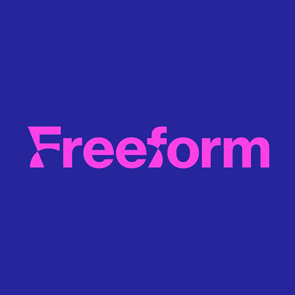
- Dynamic Motion: Negative space is sometimes used to convey motion and energy within logo designs. This can be achieved by placing and directing shapes or lines, making the text logo appear dynamic and active. As an example, look at the Freeform new logo. Rather than using the "ff," Freeform has created a proprietary font to use even beyond its logo. Despite the logo being static, it appears to move, or is about to move
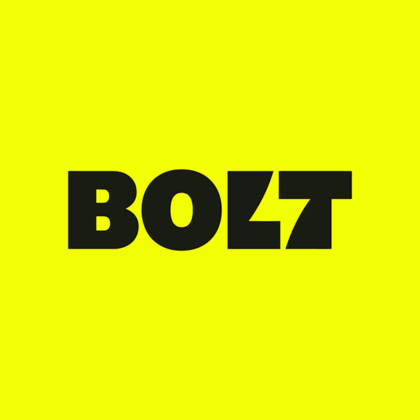
The new Bolt Design logo is the best example of this. The wordmark has drawn the most attention, as the negative space between the letter 'l' and the letter 't' articulates the brand effectively. A lightning bolt is a natural symbol for the speed and efficiency of the brand's checkout, which is why Bolt's name is intended to evoke this quality.
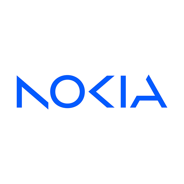
Another good example to consider is the ‘Nokia’ new logo, which shows the company's intention of heading into a different direction with a new branding style. They have completely tweaked the letters ‘N’ and ‘K’ to give it a new look.
11. Hand-Drawn Logos
A counterweight to the restraint of sans-serif fonts is a combination of sans-serif fonts, doodling, and sketches in the new logos of 2024. There is no doubt that drawing in free forms is one of the most attractive trends in the current market, but it may seem that it has become obsolete after a few years. Nevertheless, the projects undertaken within the last few years demonstrate the contrary.
The key to the revival of the trend lies in the personal approach taken by the developers to the brand. The task is well suited to quick sketches since they can include drawings of animated characters and other figures. You should prepare for many elements and fun images in this type of logo. A hand-drawn logo, which is quick and unpretentious, is ideal.
You can also try whimsical style in hand drawn logos. A creative or craft brand must have a playful logo that reflects its personality. Using whimsical wordmarks will allow you to express your creativity to the fullest extent possible. Pairing letters in different sizes or uppercase and lowercase may have the desired effect. Additionally, some letters may be shaped and oriented to create a natural focal point.
This type of hand drawn logos are most useful for brands that don't need the sophistication of minimalist designs but prefer to brand more light heartedly. Furthermore, this logo design style enables designers to incorporate more color into their designs, resulting in more vibrant colors.
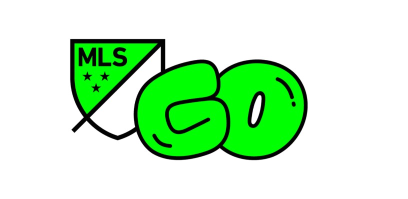
For example, look at this MLS GO new logo for kids program.
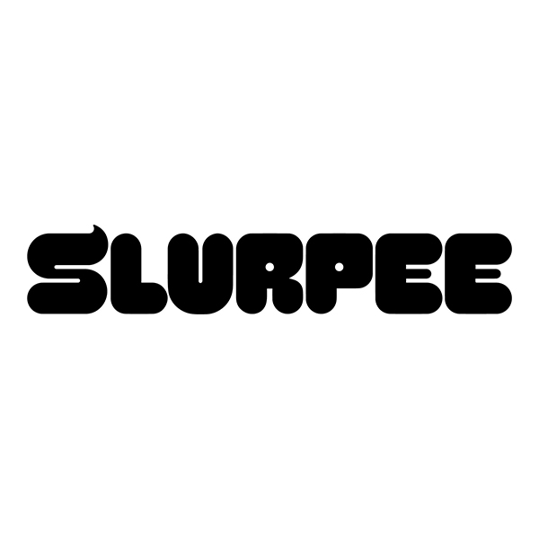
Another example is looking at the new ’ Slupees’ logo. As part of a brand
overhaul, branding studio Safari Sundays developed a similar new version but has one significant difference. Slurpee's icy peaks and liquid slushy nature are depicted in the monogram and custom typeface, Swerve.
12. Gradients and Muted Tones
There has been a trend towards muted colors among many big brands in recent years. However, one of the most popular logo designs for 2024 is the use of gradient color palette.
Previously, incorporating bright colors into logos has been challenging and time-consuming, creating further difficulties in incorporating them into a brand's design strategy.
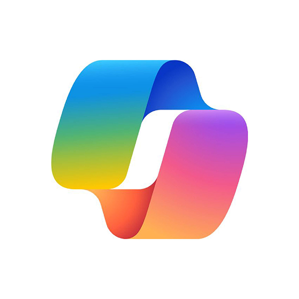
For a couple of years, gradient design has been gaining traction as a result of these trends. Microsoft copilot has recently redesigned its logo along the same trend and it looks quite catchy. It is expected that this style’s popularity will increase in 2024.
13. Retro Red Liners
Based on 2023, we will see a greater use of red (instead of black) in 2024's monochrome logos. This is particularly true if a character or mascot is represented in the logo. As a color that commands attention, red signifies heightened emotions and good fortune. Hence, it's no surprise that designers turn to it when trying to convey the personality of their brands.
This logo design trend draws inspiration from comic strips. These examples demonstrate it through 2D line drawings, exaggerated expressions, line grids, and speech bubbles. A world that is becoming increasingly fraught is driving designers to search for positives. They have made a conscious decision to reference a style of illustration that many associate with childhood, encouraging audiences to take a breather and appreciate the innocence of their childhood.
Here are a few good examples of brands using this trend:
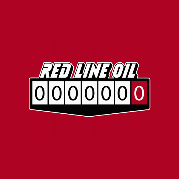
- For the new Red Line Oil red color the designer used a sans serif font. This font is also used across the branding as a headline font. This is a nice choice: not too loud but still playful and punchy without being too loud.
14. Metaphoric Storytelling: Logo as a Narrative
2024 will be the year when logos have progressed beyond their status as mere symbolic images and will become narratives in their own right. It is becoming increasingly common for brands to use symbols inside their logos to convey their essential beliefs and goals.
This narrative technique strengthens the audience's emotional bond. Think of a logo for a environmental non-profit organization that transforms just one tree into a lush forest to symbolize the brand's commitment to protecting the environment.
15. Mixing Different Font Styles
There is a similarity between this and stacked text. In a text-based logo, the fonts are varied to create contrast, similar to the contrast created by placing black text on a white background. This is an excellent way to spruce up the basics you were already using while utilizing the stacked text style.
Mixing fonts can be accomplished in several ways. Different fonts can be used for different words. Each variation of this style has one thing in common: the plain font always remains, while the fun and vibrant font always changes.
For example, look at this new branding of ‘Belcolade’, done recently. It shows Belcolade going in a new direction by introducing the first-of-a-kind chocolate, So'Choc Cacao-Trace.

16. Designing With 3D elements
Undoubtedly, 3D design is not a new development in logo design; however, it is expected to gain more popularity shortly due to new technologies; complex 3D graphics can be created more easily than ever. Statistics indicate that the trend in 3D logos will grow by approximately 20% annually between now and 2026.
3D can be beneficial in any business area, for example, when adding content to illustrations and user interfaces. Peugeot's logo features a silver lion with a three-dimensional appearance, showcasing strength and elegance.
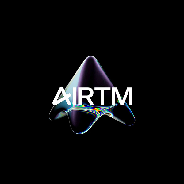
Like see the Airtm logo shown recently redesigned. A beam of light is broken through the prism in the form of the crossbar of the A in the wordmark, illustrating the idea of possibility being magnified through the use of AIRTM.
Conclusion
People gain an understanding of a brand by examining its logo and visualizing it. Considering that this is the first thing any person and potential client will see, it must be distinctive and memorable. Hire a team of professional designers who will work with you to create a logo that stands out and aligns with the latest design trends.
There are always new trends and tendencies throughout the world of logo design and branding. The trends will continue in 2024, but the context will differ; research and find what works best for you.
Get Inspiration from Logo Maker
Logo images source : brandnew.com