Selecting the Perfect Font Pair for Your Logo Design
Good fonts make good logo designs. Fonts, much like shapes and colors, carry inherent personalities that they bring to the main piece. When these personalities match — either by contrast or similarity — they create cohesion and harmony in the design and elevate the visual message.
The goal of cohesion becomes even more important when you have more than one font in the logo. How do you decide which font to give the top position and which to keep as the accent? While one must take center stage, the other should still be strong enough to hold on its own and not fade into the background.
The legibility of each font and how the pair works together as a team also become crucial factors to consider.
In this post, we discuss the basics of logo font pairings, the rules that underline these decisions, and the tips and tools that bring you a step closer to your ideal logo font combination.
Types of Fonts
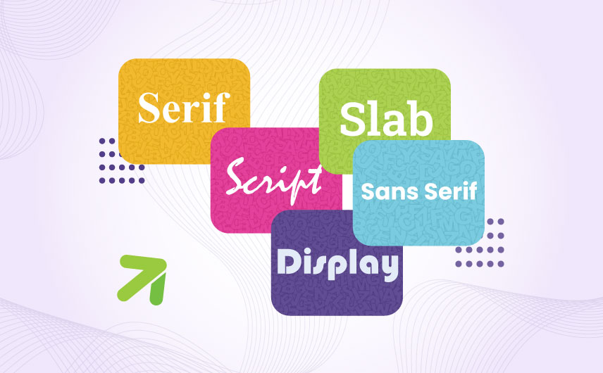
To select font pairs that complement each other in the logo design, it’s important to have a grasp of the various font types. Organized based on their appearance, purposes, meanings, and personalities, font types fall into 5 distinct categories.
• Serif
Serif fonts have been around since the 15th century. They were the first font types that were used in mass printing, and hence, are the most widely-recognized.
You can identify a serif font by the decorative flick, mound, edge, or tail it has at the end of its strokes. These decorative details are known as serifs and are responsible for making serif fonts the most legible fonts in the world.
Since they are one of the oldest typefaces, serif fonts are associated with being timeless and traditional. In brand building, designers use serif fonts in logo designs to convey trust, stability, and prestige. Serif fonts, due to their elegant curves and flicks, also express grace and beauty.
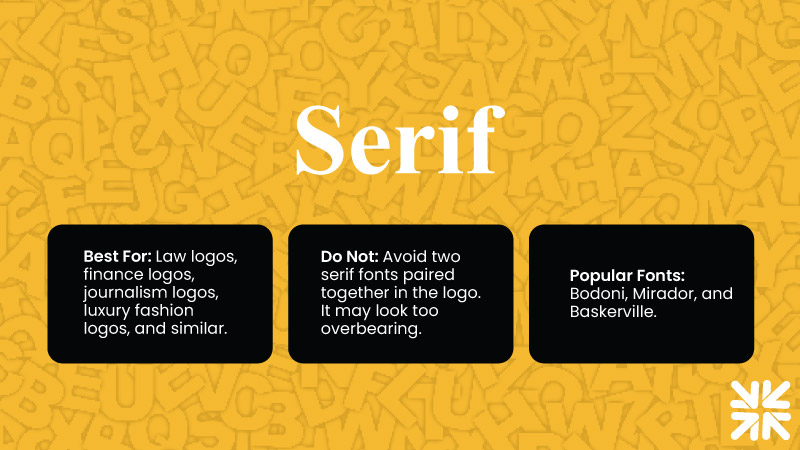
Best for: Law logos, finance logos, journalism logos, luxury fashion logos, and similar.
Do not: Avoid pairing two serif fonts together in the logo. It may look too overbearing.
Popular fonts: Bodoni, Mirador, and Baskerville
• Sans serif
Sans serif literally means no serif. Meaning, these fonts come with no decorative flicks at the end and are used as contemporary, simplified, and more easy-going alternatives to imposing serif fonts.
Modern brands across various industries use sans serif fonts in their logos to show they are futuristic and self-assured — with no need to rely on decorative typography.
From social media to technology, and legal firms to agricultural businesses, sans serif fonts have wide applications and are suitable for both print and digital consumption.
In logo design, sans serif fonts are usually paired with other sans serif fonts to create a consistently modern look. But if you want to add a touch of tradition, contemporary versions of serif fonts can be added for a more versatile effect.
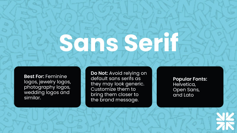
Best for: Digital media logos, technology logos, logistics logos, food and beverage logos, entertainment logos, and similar.
Do not: Avoid relying on default sans serif fonts as they may look too generic. Edit and customize them to bring them closer to the brand message.
Popular fonts: Helvetica, Open Sans, and Lato
• Slab
Slab fonts were originally a sub-category of serif typefaces. Known as slab serif fonts, they were distinct from serifs due to their thicker lines and a more chunky appearance. Those days are gone, however.
Today, slabs are their own unique category and are massively popular for logo design use due to their bold presence.
You can identify a slab font by its wider body, thicker strokes, and overall dense weight that remains consistent throughout its architecture. Unlike serif fonts, slabs do not transition between thick and thin. Their consistency gives them their slab-like appearance which can be dominating and assertive but it also has a quirky quality and a less formal appeal.
Brands who want to show authority without the forceful vibe are ideal slab font clients.
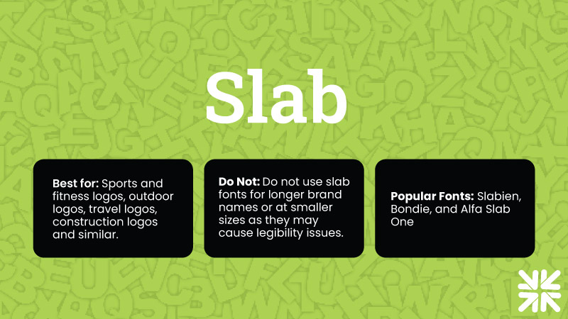
Best for: fitness logos, outdoor adventures logos, travel and tourism logos, automotive logos, construction logos, retro logos, and similar
Do not: Do not use slab fonts for longer brand names or at smaller sizes as their chunky appearance may cause legibility issues.
Popular fonts: Slabien, Bondie, and Alfa Slab One
• Script
Script fonts are designed to mimic handwriting to give your design the feel of the craft. Script fonts can be cursive, with each letter joining the next; they can also be calligraphical, highly decorative; or entirely disjointed, similar to the well-known Disney logo.
Typography experts often make a distinction between script fonts and handwritten fonts when going into details. Those details are not part of our discussion today but it’s essential to be familiar with them when you have creative decisions to make.
Script fonts are digital creations designed to look like handwriting. Handwritten fonts are based on actual handwriting and are created using a pen, brush, or digital tool. While script fonts bring whimsy and elegance to the logo design, handwritten fonts are preferred in logos that want to establish a more personal, authentic feel.
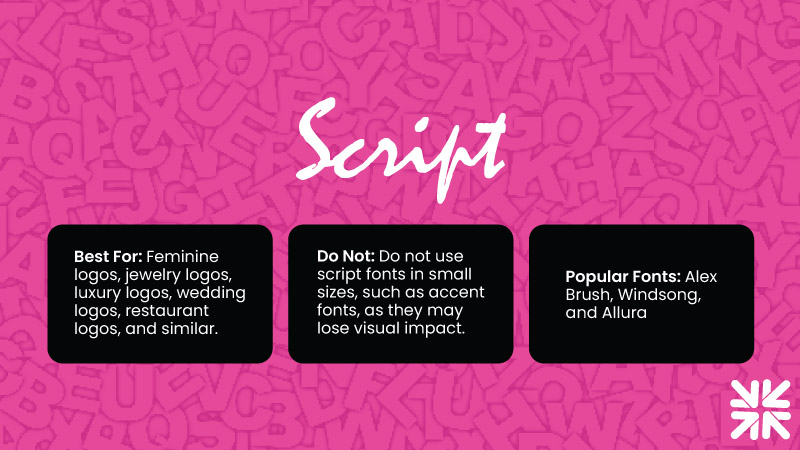
Best for: Feminine logos, jewelry logos, photography logos, wedding logos, restaurant logos, and similar.
Do not: Do not use script fonts in very small sizes, such as accent fonts in logos, as they may lose their visual impact.
Popular fonts: Alex Brush, Windsong, and Allura
• Display/Decorative
Display fonts, as you may have guessed, are purpose-driven to grab attention and be noticeable. They are large, bold, and have huge personalities. Often termed as overtly decorative versions of other font styles, you’ll find their variations in serif, sans serif, script, and other font types.
Display fonts are ideal for creating logo designs. Due to their sheer size and a commanding presence, display fonts are popular candidates for billboards, headers, and book covers, etc. They add a dominating feel to the logotype, but can be made to look more inviting when manipulated with certain colors. Baskin Robbins icecream brand logo is a great example to consider.
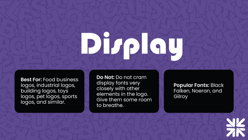
Best for: Food business logos, manufacturing logos, building logos, toys logos, pet logos, sports logos, and similar.
Do not: Do not cram display fonts very closely with other elements in the logo design. Give your display font some room to breathe.
Popular fonts: Black Falken, Noeran, and Gilroy
Rules Of Choosing Fonts
Now that we understand our fonts a little better, it’s time to discuss the rules that guide logo font combinations.
• Line Consistency
According to logo design expert, Nick Saporito, line consistency is the #1 rule to follow when choosing font combinations.
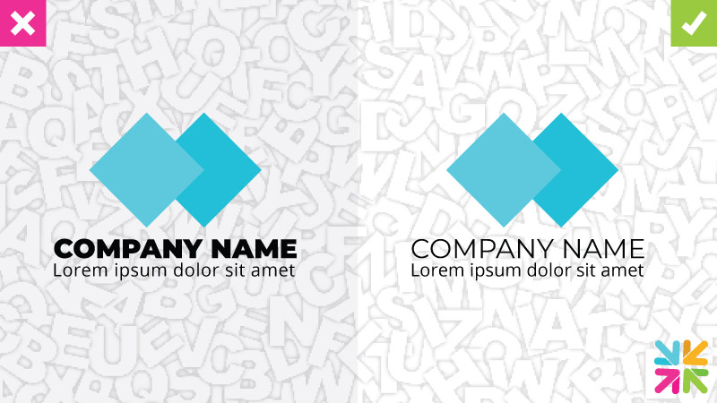
Line consistency refers to the line thickness of the two fonts you are considering. When their weight is closer to each other, it creates a more unified look. A clear inequality in the two may make the design look imbalanced or inconsistent.
• Contrasting Style
Font combinations in logo must use contrasting styles. Subtle differences help attract the attention and even aid visual hierarchy. Excessive similarities may make the logo go unnoticed as there won’t be anything holding the gaze.
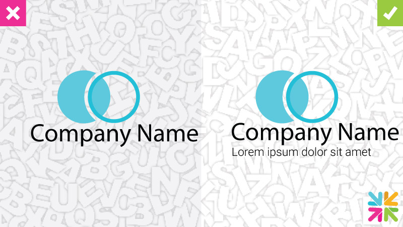
Too-similar font styles also result in poor legibility and clarity. Users may struggle differentiating between the brand name and the tagline.
• Hierarchy
Hierarchy refers to visual organization of elements in a design. When fighting for users’ attention, one font in your logo must be clearly highlighted as the hero while the other should play a strong supportive role in the secondary position.
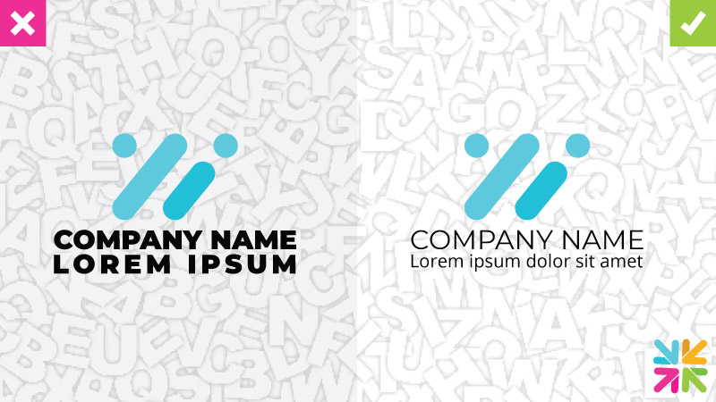
Poor hierarchy means both your fonts clashing with each other, creating a messy logo design and affecting the brand message.
• Two Fonts
A rule of thumb when pairing logo fonts is to stop at two. Two crisp fonts that complement each other well should suffice in most logo designs.
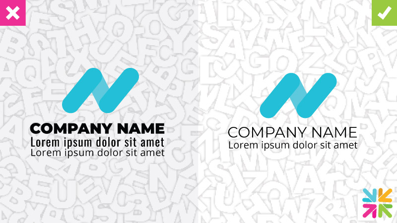
If you believe your brand needs a third font, it may be time to revisit your original logo concept and make some changes. Three fonts in the limited space of a modern logo will create an extremely busy look, doing nothing to help your brand.
• Legibility
Modern brands use their logos on diverse media applications. From print to website and merchandising to social media, a modern logo has a lot of ground to cover.

Facilitate your client in this goal by ensuring both fonts in your logo are legible on mobile screen as well as print. Be extra watchful with certainf font families as their large case ‘L’ and small case ‘i’ may have similar line consistencies and heights and thus create legibility concerns.
Tips For Choosing Fonts
While the rules of the game serve as your blueprint for successful logo font combinations, there are tips and tricks that designers have innovated and perfected that elevate your design and give it that X factor.
• Opposites Attract
Always select the font pair in your logo where the visual differences are the clearest without being discordant.
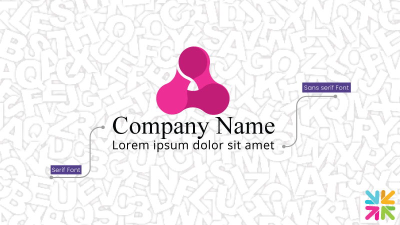
Functional contrasts create excitement and harmony in the logo, and are referred to as complementary font combinations.
You can create these complementary font combinations by choosing fonts from the same family or looking a bit farther outside. Whichever way you go, agree on some core principles so you have a structure to work with.
Pairing a serif font with a sans serif one, for example, is classic way to achieve this balance. Given its popularity, it’s also the most used and therefore can look dated.
Add some spark in the design by using creative font pairs. An elegant display serif font (Playfair Display) with the easy Open Sans. Or joining a monospace font with a simple sans serif. Using an attention-grabber font as your primary one is always a good bet to go with.
• Choosing From The Same Family
Font families refer to sets of fonts that share similar designs. Examples include Times New Roman, Arial, Georgia, and others. Within the family, you can have variations in weight (bold vs. regular) and slant (italicized vs. normal) but the foundational style will remain the same.
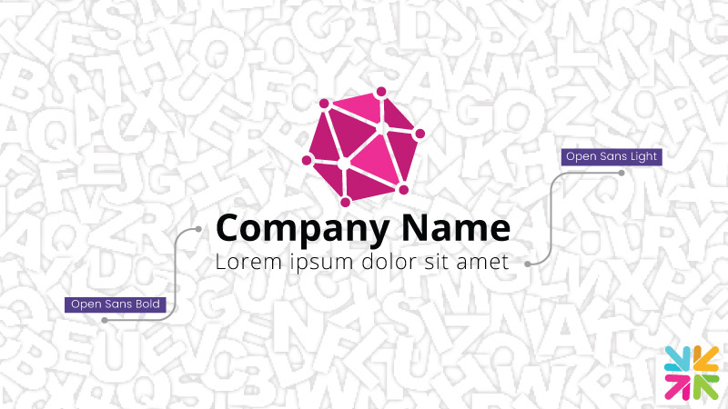
When you choose logo fonts from the same family, you cannot go too wrong in terms of achieving a balanced look. It may be a safe choice but nothing wrong with being safe when you are just starting as a designer.
Considering that are tens of thousands of unique fonts out into the wild at the moment, even if you choose both your fonts from the same family, you can still achieve a distinct pair that will augment your logo design and brand message.
• Kerning Variations
Another way to add a bit of drama to your font pairing is play around with kerning variations. Kerning refers to the spaces between individual characters in the font. Depending on the weight of the font, tightly kerned typefaces can look relaxed or domineering.
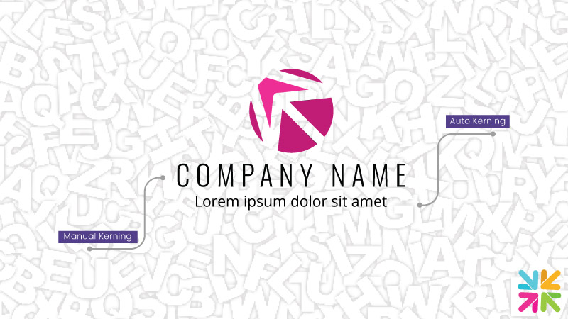
In font combinations, a tightly kerned font with something more loose and relaxed will provide great balance and contrast to the logo.
• Follow the Middle Lane
A great tip for best logo pairing is to stay in the middle when picking complementary fonts. Not too similar nor too different.
While some brands — such as those who intend to send a powerful message — rely on conflicting font combinations, those are strategic decision made to achieve specific goals.
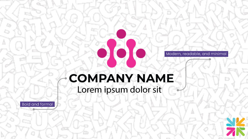
Generally, font combos in logo design have to create harmony.
Pleasing looking font combinations in logo design are always those that share similar properties but have unique personalities that are noticeable from a distance.
• Same Font, Different Weights
This one may be a lot of fun to explore. It’s somewhat risky but nothing that a good bit of design cannot safeguard against.
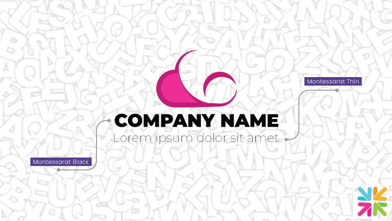
Instead of trying to spend ages looking for two perfectly matching fonts, why not use the same font but in disproportionately different weights? Imagine your simple Montessarat in Black paired with its Thin counterpart.
Easy on the eyes but with enough complexity to keep your focus.
Font Pairings Tools
For the best font pairing for logos, take some help from crowd-favorite digital tools that designers always rave about.
• FontJoy
See automatically generated font combinations in sets of three with header, subheader, and body font examples. Just click on the Generate button on top of the page to move to the next combination.
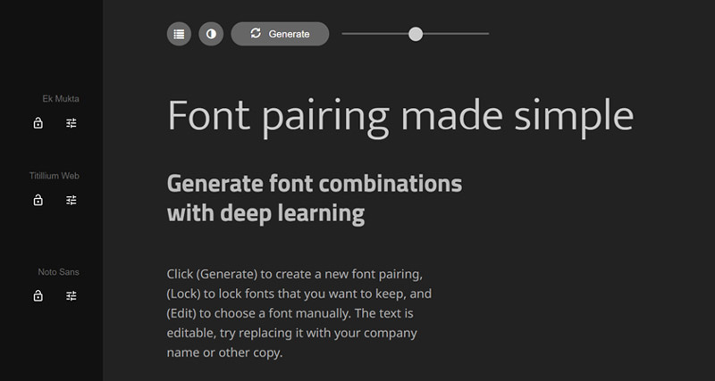
Explore variations in individual fonts, lock your favorite ones, and adjust contrast to your liking. You can even add your own content up there to see how the fonts will look in the context of your brand.
• Google-Type by femmebot
This font pairing tool lets you experience beautifully paired fonts in the background of wondrous pictures and inspiring story passages.
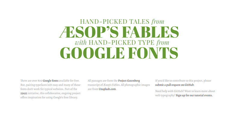
These font pairings range from creative to modern, geometrical to classic, and futuristic to feminine. Plus, countless more.
• MixFont
The best thing about this font generator is not only that it lets you see and generate multiple font pairings but you can also see those combinations in the backdrop of modern branding and merchandise.
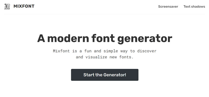
Every time you like a font pair, scroll down and see how it will look on your calender, app notifications, mobile web page, social media images, and more.
With a simple refresh button on the bottom-right of the page, you can immediately switch to the next font pairing and consume it live.
• FontPair
Keep things simple with this hassle-free font pairing tool. Just a huge variety of beautiful functional font combinations from 6 unique font categories. Using editable text boxes, write your own content and see your brand message displayed in your favorite fonts.
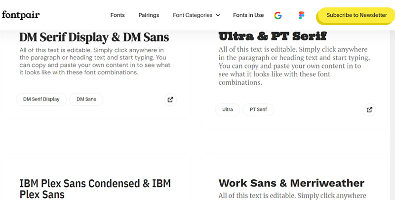
The tool uses Google’s free fonts library so you can benefit from the free source and exercise complete creative expression.
• Typ.io
Through this font pairing tool you can take inspiration from real world font pairings used online and elsewhere, from a diverse range of industry sectors.
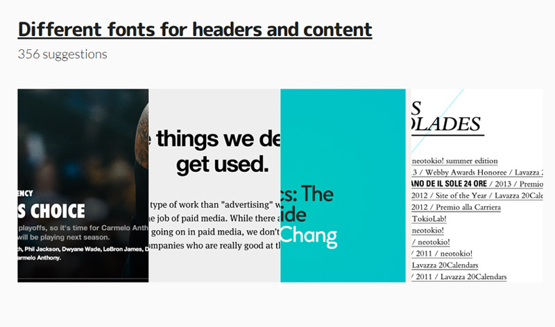
Look for brands with brand sentiments similar to yours to help inspire your font combination process.
Conclusion
Font pairing may not be a true science but there’s an art of choosing two fonts that work well together on a logo design.
Balancing contrast with complementary tones, taking care of the visual subtleties, and keeping a sharp focus on clarity and legibility, you have to walk a tightrope when exploring font pairs for logo designs.
We hope this guide has helped make this process a little easier for you. Bookmark this article for the next time you have to create a logo font pair, and use the tools and techniques we’ve shared today.
In the end, when you can’t decide between the two pairs, go with what your gut says. Good design is as much about the heart as it is about logic.