Wordmark Logos: Understanding the Basics and Benefits
Wordmark logos are probably the most popular form of logo design. Present in every market from fashion to tech and food to personal branding, wordmark logos are timeless, classic, and all about simplicity.
If you are looking for a logo style that champions brand names and uplifts brand identity, put your faith behind a wordmark.
In this article, we cover the basics of wordmark logos and share tips on how to create one for your brand. We’ll discuss wordmark logo examples plus dos and don’ts to ensure your wordmark logo design process is a success from start to end.
What is a wordmark logo?
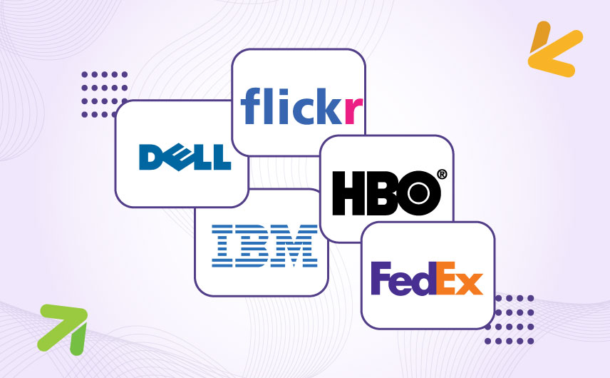
A wordmark logo — also called a logotype — is a text-based logo made up of your brand name, minus any symbols, graphics, or icons. Some popular examples include Google, Sony, FedEx, and more.
Since there are no icons and only the brand name, some consider wordmarks as the ‘purest’ form of logo.
But purest or not, wordmark logos, for sure, are one of the most impactful forms of logos. They put your brand name front and center and are ideal for brands that want their brand name out there, gathering recognition and momentum.
In terms of categorization, wordmark logos belong to the typographic logo category. Alphabet logos belong to the same. The key difference is that a wordmark contains the full brand name while lettermarks contain its initials or acronyms.
Brands can choose to have either wordmarks or lettermarks, but in most cases, letter marks act as wordmark variations for smaller spaces like favicons or social media profile pictures.
When to choose a wordmark logo
Logo designs come in at least 7 distinct categories and there are best use cases for each. When does it make perfect sense for your local business to have a wordmark logo?
- If you have a short brand name. One-word brand names are ideal but even two-word names can work. Anything long and you might want to use a letter mark or a monogram.
- If you are a relatively newer brand. Startups are the best candidates for wordmark logos. You get strong name recognition with a simple design, and your brand name generates more street cred.
- If you have a distinct brand name. Unique brand names like Google or Ikea should be presented as wordmarks. There can be an instant recall power in such names that you don’t want to hide behind a vague graphic.
- If you have a diverse product portfolio or an ever-expanding one. Wordmarks give you more flexibility to venture into diverse markets. In the absence of a single graphic limiting your brand perception, wordmarks allow you to be perceived as a service provider for several different products and services (Google, Braun, Hubspot).
- If you are a personal brand or a professional service business. If you are your brand, your name needs to be the center of attention. Step into its power by turning it into a wordmark logo.
The basics of a wordmark logo
What are the basic tenets that make a good wordmark logo? Let’s dive in.
1. Choose the right typeface
With a wordmark logo, everything depends on the typeface or font you choose. Because you have no graphics or symbols to draw the eye elsewhere on the logo, you need to make sure that you get the font right for your wordmark.
It needs to be simple, legible, and illustrative of your brand personality. Remember that words carry meaning but it’s the style of the font that conveys the personality. ToysRUs logo won’t have the same playful personality if you decide to write it in Baskerville and paint it all black.
To choose the right font for your logo, figure out a few things first:
- How do you define your brand character? For example ‘glamorous’ or ‘small town’. Make a list of some adjectives that describe it well then choose a typeface to match.
- Do you plan to use your brand name in all-caps, title case, or lowercase? The way individual letters are designed in your chosen fonts (in uppercase and lowercase) will affect your wordmark’s look, feel, and legibility.
- Does the typeface you want have enough weight or spacing variation to allow you to adjust these features to fit your brand character?
To help you with your font search, here is a quick recap of major typefaces out there:
- Script — These mimic handwriting fonts and calligraphic styles. Script fonts humanize a brand and bring a personal feel to it. They’re perfect for personal brands, feminine brands, and craft-related ventures.
- Serif — These have decorative flicks or edges to their ends. Want to make your wordmark look traditional and legacy-based? Serifs are your best choice.
- Sans Serif — Literally meaning ‘without serif’, these are the most modern font styles, popular across industries and markets. They look casual, clean, and contemporary. Use them to make your wordmark look instantly young and modern.
In addition to these three, typefaces are further categorized into slab, display, monospaced, and more.
Pick the one that best represents your brand’s core voice and vibe.
2. Personalize the logo by adjusting size, kerning, and alignment
Sometimes the letters in the wordmark are squished together and other times they are spaced too far away. Take a look.
Along with the weight and size of individual letters within the wordmark, spacing also plays a role in reaffirming the brand message. Crate & Barrel is luxury chic while West Elm is clean, earthy, and modern, and that’s why that airy quality in the wordmark logo.
Designers often adjust the kerning (space between individual letters) to adjust the weight and alignment of the logo. Letters may be brought together or spaced apart to introduce meaning and function.
The FedEx logo popularly uses its narrow-spaced logo to create an arrow icon from within the negative space.
Alignment is an important element too. If all the letters in the wordmark are aligned on the same plane, it’s a strong and sturdy brand. If the letters are in dance motion, your brand can look funky and exciting. You can even use wordmark alignment to make your logo look skyward, as Virgin Mobile and Ray-Ban do.
Or you can make your wordmark logo look as if it’s sitting on a curve, like the Kleenex logo.
By adjusting the size, spacing, and alignment of the letters within a wordmark, you can create an outstanding typographical logo that can rival even the strongest pictograms out there.
3. Introduce the character twist
The naysayers against the wordmarks often claim that text-based logos are boring. There’s no element of surprise or meaningful symbology.
But typographical logos by Braun, Zippo, Flickr, and HBO turn their argument into dust.
All of these logos have character details that stand out. Whether it is Braun’s ‘a’ that towers over the rest of the logo or HBO’s versatile ‘o’ that works as its alphabet logo favicon, wordmarks can have twists and surprises that always delight.
You can introduce these twists by choosing a font that already comes with inherent character features that you can leverage or by manipulating a single letter manually so it stands out and draws focus. Color and additional features (like the exclamation point in Yahoo) can be used as a highlighter too.
When adding any such detail, make sure you are doing it for a functional reason, like the Logitech logo. It breaks up the ‘G’ and turns the symbol into a smile, ensuring a positive sentiment is conveyed every time you look at the logo.
4. Learn to speak in color
Wordmarks logos aren’t for the color-shy. With so little graphic help at hand in the forms of symbols or icons, colors help wordmark logos stand out and command attention.
Using color as a communication tool, you can make the Dior and Cartier logos look even more chic and avant-garde. Or use a bold shade to make the simple sans serif of the Johnson & Johnson or Lyft logo look more trendy and fresh.
The Duolingo wordmark in cheerful green and the timeless IBM with its blue line art logo are some more examples.
Since typefaces are the leading logo design trend, you can also choose a bold typeface and have each of your letters in different colors. Google, ToysRUs, and eBay all sport colorful wordmarks. Nook does too but it uses a muted color palette which is perfect for an e-reader brand identity, conveying calm and serenity.
Talking about colors, remember that your logo needs to be functional on multiple mediums including print. So experiment with different backgrounds and color reversals to ensure that your wordmark looks legible and recognizable no matter the surroundings or atmosphere.
5. Consider your letter cases well
There isn’t any room for mistakes when you are creating a wordmark. Every part of it matters because there are so few elements to go around.
This means that even something as small as the letter case you’ll use in the wordmark carries a lot of weight. Notice the difference between these two?
Both use a thin typeface, but the all-caps Time logo tells you it wants to be taken seriously whereas Sears appears more accessible and friendly.
The most common letter case for wordmarks is the title case where the first letter is in uppercase and the rest in lowercase. But changing things up a bit, especially with a meaningful intention, can get things moving.
The New York Times, which is a four-word wordmark uses the title case for its fullest advantage but the Simpsons forgoes the tradition by using a lowercase ‘the’ and an uppercase ‘S’ for the family name.
6. Split the wordmark in contrast
Make your wordmarks more engaging and inviting by adding contrasting details that make you want to do a double-take.
Contrast is an important element in logo design where you introduce a disparity or distinction to stop people in their tracks. It makes the design look more appealing and can even improve legibility, not to mention adding meaning to the wordmark.
Subway and Huda Beauty use contrasting color combinations to signify that their wordmarks carry two different words. In the case of Huda Beauty, this distinction is more stylistic and aesthetic than necessary but for Subway, color is the only identifier of the brand name having two separate words.
Beyond color, the size and weight of the fonts are creative ways to introduce contrast in wordmark logos. Think of the Bed, Bath and Beyond logo which uses contrasting weights, spacing, and font widths to introduce meaning to the logo. As does Citibank.
These contrasting details not only add visual interest to the wordmark but allow the brand strategist to hide important brand messages in them making the wordmark that much more powerful.
7. Add shapes to your wordmark or turn your wordmark into one
The majority of the wordmarks exist in only-text forms, in a kind of invisible square or rectangle container.
But then designers do fun things like take shapes and insert them into or onto the wordmark. For example, LinkedIn, Showtime, or Caterpillar.
In each of these logos, shapes have been added to the design to highlight words or characters and thus convey something that the simple wordmark couldn’t do.
For other logos like Intel, Ikea, and Kraft, the entire wordmarks are contained within shapes, lending the logo a stronger, more intentional feel.
Along with introducing external shapes into your wordmark, you can choose to turn your wordmark into a distinct shape. In letterforms, these logos are called monograms. Monograms are when you take an alphabet logo and manipulate the letters into unique shapes, turning the letter-based logo into a pictorial graphic.
Remember that a monogram doesn’t form just by styling a letter or placing two together. A true monogram is a unified shape where letters connect, combine, and come together in a way that makes the logo look like a consolidated symbol.
8. Be careful when adding a slogan
For a full-bodied brand, brand slogans are a must. You can use them to communicate your brand promise (The World on Time — FedEx) or use their powerful energy to galvanize your community towards a common, lofty goal (Think Different — Apple).
But with wordmark logos, slogans don’t come in the package plan. That’s not to say that wordmark logos never use slogans. They do, but it isn’t the norm.
Since they are type-based logos, most designers avoid using slogans so as not to make the logo look too wordy.
How do you avoid this conundrum?
Use your brand slogan on brand materials other than your logo. Your staff uniforms, product packaging, or brand merchandise, for example. Since your consumers routinely interact with these assets, your slogan can get recognition and (if it’s good enough) may gather a fan following of its very own.
Benefits of a Wordmark Logo
Wordmark logos are cool but getting them right requires expertise. Are they really worth all this effort? Let’s find out.
• Wordmarks reinforce your brand name
Graphic logos can look good and symbolic, but they hide the most important part of your brand identity: Your brand name.
Wordmark logos take your brand name and make the design all about it. Whether you are using an alphabet logo (for your brand name initials) or the full name in the wordmark, these logos keep your brand name center stage.
New businesses, startups, and brands can all benefit from the constant reinforcement that wordmark logos bring. Every time you promote your brand with a wordmark logo, people can learn who you are and develop quick brand recall as a result.
• Graphic logos are difficult to get right
The key to a meaningful graphic logo is to land on the right symbol. But most often, those symbols can be limited. A burger icon for a quick-service food startup may sound fitting now, but in a few years if you expand the business and turn it into a luxury restaurant, that burger icon will become obsolete.
Even if nothing changes and your symbolic logo remains relevant, getting the icon right the first time can be challenging. Too simple and the logo will look amateurish and bland. Too complicated and you run the risk of losing the brand message in all the abstract details.
A wordmark logo lets you strike the perfect balance between relevance and mystique. No matter how much you expand, change, or modernize, the wordmark logo can remain timeless and add to your legacy even after redesigns.
Plus with a wordmark, you don’t have to worry about making it too complicated. By default, a wordmark rejects any superficial design efforts. Since legibility is everything with a wordmark, even if you try and go over the top with complicated details, you’ll eventually have to retrace your steps and decide on a simpler identity for the sake of clarity and meaning.
• Wordmark logos have a more perceived brand value
We told you in the beginning that experts consider wordmarks as the purest form of logo designs. Without the extra frills of symbols and shapes, wordmarks go back to the basics of having family name seals and insignia.
So, when you create a wordmark logo design for your brand, you allow your brand to be perceived as a more classic and uncontaminated symbol of identity.
Customers also trust wordmarks because of the authenticity and transparency they bring to design. By telling you who they are, and what they are called, they own the brand with confidence, and that confidence resonates with the audience.
Conclusion
Wordmarks are the most popular form of typography logos where we turn brand names into logo designs, with no additional symbols or icons. With the whole focus of the design on the brand name, it brings great value and recognition to the brand.
By using typefaces, colors, contrasts, and organization creatively, we see the full power of wordmarks come into focus.
As with all other forms of logo design, make sure whatever details you add to the wordmark are rooted in functionality as opposed to pure aesthetics to create meaningful identities and impactful brands.