Exploring 8 Key Elements Of Branding: An In-Depth Look
The global consumer market is a bustling epicenter of more than 4 billion consumers. In 2024, a hundred million more people will be added to this number.
As businesses all over the world look for more cutting-edge, inspiring, and inventive ways to attract these billions of consumers, can you afford to get lost in the crowd?
Branding — the holy grail of marketing and business success is the way to ensure you don’t. With branding, you can strive to stand out and carve out a loyal brand following.
In this post, we’ll cover a lot of ground regarding branding. Starting with breaking down branding in the easiest possible way to understand, we’ll talk about the makeup of branding, the essential elements that come together to form this process and share tips on how to ace each step.
Without further ado…
What is Branding?
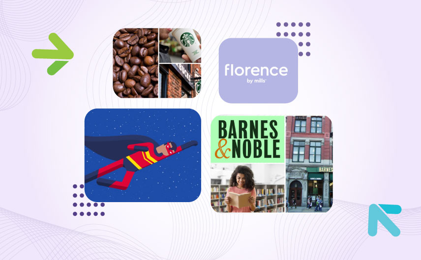
Branding is easy to see and experience. When you walk into a Starbucks and see the familiar architecture of the cafe, order your favorite drink and know that the taste is going to be exactly like the last time, and then have the order delivered to you in a white and green cup, the signature color combination of the brand — that’s branding on display. It’s very tangible and visceral.

But if you have to explain it, the right words may not come easy.
But let’s give it a try.
Branding, at its core, is very much like storytelling. You have a hero, some hurdles, and an eventual goal.

Image Source: Dribbble
Branding allows you to give your hero (your brand) the perfect backstory, the perfect characteristics, and the perfect visual qualities. Marketing and advertising are the plot devices that branding uses to drive the hero towards the ultimate goal: better sales, more customers, greater brand penetration, or something else.
But while all good stories end, successful brands do not. And you have branding to thank for that. In the right hands, branding ensures that your brands can survive downfalls and even near oblivion. In the right hands, the hero will always come back and have an even greater story to tell.
Barnes and Nobles: A Great Branding Story

Take Barnes and Noble as an example. The bookstore chain almost collapsed around the 2010s. After failing to compete with Amazon on better prices, the company had no idea what to offer its consumers. It definitely could not offer them the bookstore experience. For decades, Barnes and Noble had done everything to shun that identity. It has assumed the role of a bookstore behemoth with its mall-like stores with giant escalators and shelves that were filled with stuff that had nothing to do with readers, reading, or books.
But branding, or rebranding, saved it from total collapse. After an entire decade, the company turned a new leaf and announced in 2022 that it would be opening 30 new stores.
The plot twist: the stores are going to be smaller and cozier. Filled with nothing but books, Barnes and Noble is now committed to giving its readers the joy of strolling around the store, flipping through pages, and stumbling upon delightful accidental finds.
The company is also turning its store managers into brand managers. Giving them a level of autonomy they did not have before, managers will now have the freedom and flexibility to localize their store (its layout and design) and stock books that their local communities want to read. They are also allowed to run unique marketing campaigns at their stores that may not be available in other stores in another state.
Barnes and Noble has now become an underdog success story, all thanks to strong branding changes.
8 Basic Elements of Branding + Examples
We now know how powerful branding can be. So let’s see what it’s made of.
Branding consists of 8 crucial elements that are necessary for the formation of full-bodied brands. Think of these elements as building blocks of branding. Get each of them right and you’re closer to success than you think.
Here are these noble 8 elements of branding:
- Brand Name
- Logo Design
- Color Schemes
- Typography
- Tagline
- Tone of Voice
- Imagery
- Brand Positioning
While each element is important, we’re splitting the list into two groups — visual elements and non-visual elements — to aid comprehension and to enable understanding of their thematic differences.
● Visual Elements of Branding
All of these elements are design-related and serve as evident and noticeable marks of branding.
1. Logo Design
Your logo will be your brand’s prime identifier. Some even call it the official identity of the brand, and they aren’t too off the mark. Because while brand names are sure at the top, people often remember logos better — the human brain is just wired that way. We process and remember images with much more precision and ease than we do words.
That’s why brands that use creative wordmarks as their logos strive to turn their brand name into meaningful symbols.
The FedEx logo is a clever example of that.
For those who never noticed, the negative space in the logo design between E and X forms a forward-facing arrow. This hidden creative detail allows the wordmark to become more memorable and meaningful. Landor Associates, the consulting firm that created the iconic logo says the FedEx arrow is a subtle but powerful representation of “getting from point A to point B reliably, with speed and precision.”
While creating a meaningful logo is essential, it’s only half the battle. Your logo design has to represent the brand in several places. It has to go on your website, mobile app, company letterhead, social media profiles, branded templates, marketing emails, and all sorts of promotional assets.
Therefore, it must be versatile. We suggest using 4-6 logo variations so you have at least one style suited for each different platform. These variations could include:
- Primary logo: Usually a horizontal logo but vertical or stacked ones are also fine.
- Secondary logo: It’s your primary logo with minor adjustments. For example, if your primary logo is horizontal, the secondary logo could be stacked. Or vice versa. The role of this variation is to be as close to the primary design as possible but have some room for maneuvering if there are space constraints.
- Only-icon: Your brand logo variation using only the brand symbol or icon. Perfect for the smallest spaces.
- Wordmark or letter mark: It’s your brand logo sans all imagery and symbols. It’s a font-based variation consisting of only the brand name or acronym.
Remember that each logo variation has a unique role to play, so assign those functions responsibly. Use a branding style guide to lay down all the rules so there isn’t any room for misinterpretation.
2. Color Scheme
Colors are statistically more powerful in branding than any other element. When people make assessments about a product, company, or brand, 62-90 percent of those assessments are based on colors alone.
Colors also influence moods, attitudes, and behaviors. It’s no fluke that when you look at pastel shades you feel calm and peaceful. You think of words such as ‘muted’, ‘passive’, ‘relaxed’, or ‘serene’. But these associations jump to the other end of the extreme when you face colors with high saturation or contrast. ‘Energized’, ‘confident’, or ‘shocking’ may come to mind.
These associations and the relationship between colors and emotions are studied under an exploding field of research, called Color Psychology.
Color Psychology plays an important role in how we think or feel about a brand. The colors in the logo design help us personify the design and associate human qualities with them.
Look at the Slack logo’s color scheme.
It’s brightly colored and has 5 different shades in the palette. Each of them has a strong personality but the designer’s skill shines through as the balance has been handled beautifully.
It makes the logo look confident and empowered. A user witnessing this design will extend these associations to the brand, making the brand look more trustworthy, authoritative, and an expert in its field.
3. Typography
Fonts are also a powerful element that helps you achieve specific goals through your branding. Similar to colors, they carry inherent personalities that they bring to the design. Consider the font of The New York Times Logo.

It’s a custom font designed specifically for the New York Times. One, because it’s custom, and second because it’s highly stylistic and contains the old-world charm of a traditional serif font, it lends a highly prestigious feel to the publication. It tells you that this is a classic brand, has been around for a long time, has seen and experienced stuff, and has an established legacy to protect. In simple words, it tells you that it can be trusted.
Does all of this happen just because it has a fancy font? Absolutely not, but it helps. That is why brands who want to seem trustworthy and established usually go with imposing serif fonts — to communicate a sense of experience and longevity.
Other font types popular in branding include sans serif, script, slab, and display. We have talked about them in detail when discussing logo font combinations. Do check it out for a deep-dive reading.
4. Imagery
This includes all the different kinds of images you use in your branding, marketing, and advertising.
Things like various kinds of graphic templates you use for social media or email marketing, the kinds of photos you post online, the style of product packaging you have, the featured images you use on your blog posts, the photographic style of your brochure, the videos you make, and other branded content.
The style of imagery you use must match the brand’s overall visual aesthetic. Following are the Instagram feeds of two global makeup brands: Florence by Mills and Victoria Beckham Beauty.
And here them on their respective websites:

Image Source: Florence by Mills | Victoria Beckham
As you can see, both brands have stark contrasts in their imagery style. There are a lot of florals on Florence by Mills. Lavender is featured prominently, product photography is lightweight and fun, Millie is heavily involved, and the thematic focus is youth and clean ingredients.
Victoria Beckham has something completely different going on. In contrast to Millie’s fun and playful vibe, VB Beauty is dark and mysterious. The banner has a sexy image on top of it with water lapping all around her. The product imagery is stark, lean, and minimal. No flower in sight.
These differences aid each brand in creating and sustaining an individual style for themselves. In branding, consistently following a unique visual style ensures that consumers can identify their favorite brands in a crowd and also form unique emotional associations with them. This is why you may think VB Beauty is dark and sexy but Florence By Mills is young and fun.
● Non-Visual Elements of Branding
While these elements may not be as visible as the visual ones, their power lies in subtlety. As foundational elements, you must get them right or risk creating a design that doesn’t align with the brand’s self-identity.
1. Brand Name
You can’t have a good story without a good title. Okay, maybe you can, but should you? The title plays a crucial role in communicating the spirit and sense of the story. Writers put in a lot of effort trying to come up with the right title with the right amount of zing.
The same rule applies to the brand name. You may think it won’t matter much and maybe it won’t, but if you decide to put in some effort and hit gold, the result can be as magnificent as Nike.

The athleticwear brand is named after the Greek goddess of victory. As a brand that aimed to be known as the brand of champions, it’s a pretty apt name, won’t you say?
In addition to being meaningful, Nike is also short, unique, easy to spell and pronounce, and has a memorable quality. In other words, it fits the criteria of being a great brand name.
Heed these criteria when investigating names for your brand. While it definitely can be longer than one word, don’t sacrifice uniqueness, meaningfulness, and phonetic simplicity in the process.
2. Tagline
Taglines also do their bit to further the goals of branding. These melodic, pithy phrases help us remember the brands better by acting as a verbal mark of the brand. Every time we see a brand’s logo complete with its tagline, or hear it in an ad, the repetition allows us to associate the two more closely in our heads.

Back in the 1980s when Apple was struggling to find a fitting brand identity, two of its ads with two different taglines helped it find its voice.
The first was a bit long and could be termed as the entire copy of the ad. On January 24th, Apple Computer will introduce Macintosh. And you’ll see why 1984 won’t be like “1984”.
Here, see it in action.
It drew on the dystopian future foretold in George Orwell’s novel, 1984, and Apple positioned itself as a tech company that would save humanity from that future. The long tagline, we must say, was also extremely strong and powerful. It made a bold statement which got everyone excited to find out just how good Macintosh would be.
Apple’s second ad created history. It propelled the company into global fame and collective adoration. By featuring creative thinkers and non-conforming revolutionaries in its ad, Apple aligned itself with The Crazy Ones who had changed the world.
Take a look:
The ad concluded with the tagline Think Different — which continues to inspire everyone and has cemented itself in history as one of the most iconic business slogans in the world.
As a newfound brand, you may not find it easy to come up with a killer brand mantra. To address that, we have recently done an article on how to craft a great business slogan and show you that the process can actually be simpler than you imagine. Go take a look.
3. Tone of Voice
Have you ever felt that every brand has a certain voice that they speak in? You can hear it when you watch their ads, look at their social media, and read the marketing emails they send you.
It happens because branding is taking place. Brands develop a unique communication style and language that fits with their overall persona. That’s why brands have these subtle differences in linguistic styles and the way of communicating through which you can identify them.
Ever visited Wendy’s on X (previously Twitter)? They are snarky, savage, and deliciously sarcastic.
Do your worst, @Wendys.
— A&W Restaurants (@awrestaurants) January 12, 2022
Check out InStyle and BazaarUK on Instagram. Both are fashion and style publications but InStyle is cheeky, and hip, and you’d go give them a high-five if you ever meet them on the street.
But BazaarUK is kind of pompous. They take themselves seriously and it comes across in their articles, photo captions, and editorials.

Image Source: Instagram.com/instylemagazine

Image Source: Instagram.com/bazaaruk
The process of branding involves finding and strengthening your brand’s tone of voice. It also includes choosing vocabulary and a unique way of crafting content that matches the brand persona. If your brand persona is serious and professional, and you cater to the B2B industry, using street slang on your social media photo captions might not be a great idea — unless you’re being ironic.
Look at some of the adjectives that Hulu chooses to describe its tone of voice:

Image Source: Hulu Brand Guidelines
You can see how following these principles allows Hulu to have a voice that would be markedly different than say, IBM’s or Wendy’s or Marine Corps’. Your brand’s unique tone of voice not only works as an identifier but also facilitates positive brand associations.
4. Brand Positioning
Where does your brand lie on the spectrum of consumer choice?
Brand positioning is the element that decides that. Think of it as a space or a niche in the market that your brand will fill. The problem it solves for the consumer, the price point that this solution is available at, and the target market it caters to, are some of the factors that determine where on a supermarket shelf your brand will be placed.
Branding helps you position your brand just right. It looks at what you want to compete with and enables you to make design and other choices that are in connection with that. For example, if you want to appear more economical than a certain brand, your design choices will be different from that brand. You might choose brighter colors or a more approachable packaging design. You might also want to highlight your price in the design. Your tone of voice will also be friendlier and more casual.
All of this will be flipped to the other side if you want to appear more exclusive and luxe. You’ll choose darker colors (black is the ‘it’ color to announce stealth wealth) and refined fonts. Your brand will speak in an affluent language with a more sophisticated style to connect with its intended market niche.
When you position your brand right in a given market, consumers can draw comparisons with other brands and choose yours over others.
Seal Your Branding with a Brand Guide
If you thought branding was a huge hill to climb, imagine the chaos that’ll ensue when people promoting your brand keep getting one or the other thing wrong.
Marketing a brand is always a team effort with multiple moving parts at any given time. Having a branding guide where all the rules of engaging with your brand are laid out in the open will save you a lot of headaches and PR disasters.
When you have figured out your brand’s design and marketing rules, use a branding style guide to keep everyone on the same page and present your brand to the world stage with flawless consistency.