What is the Golden Ratio? And How Is It Used in Logo Design?
While beauty and art may be subjective, there exists an alleged divine number, known as the golden ratio, that artists and designers have probably used for thousands of years to create awe-inspiring perfect works of art.
The golden ratio sits at the foundation of the Pyramids of Giza, in the structure of an average human body, and the well-known National Geographic logo too.
Hailed as divine proportion, this number is believed to create harmony and balance so perfect and exact that you can’t help but feel immediately attracted to the design. Since we are hard-wired to respond to order and organization, incorporating the golden ratio helps us tweak our work to fit our innate leanings.
In this article, we go through the deep end with the golden ratio. We discuss what it is, the history behind the enigma, its various applications, and how to make it a part of your regular logo design process.
What is the golden ratio?
The golden ratio is the ratio between two numbers, roughly equal to about 1.618. Mathematically, two numbers are in a golden ratio relationship if the ratio of the small quantity (a) to the large quantity (b) is the same as the ratio of the large (b) to the whole (a+b).
To explain it further, here’s a visual example.

The golden ratio is also known as the golden mean, the divine proportion, the golden section, and has several other revered titles. It is also denoted by the Greek letter phi — φ.
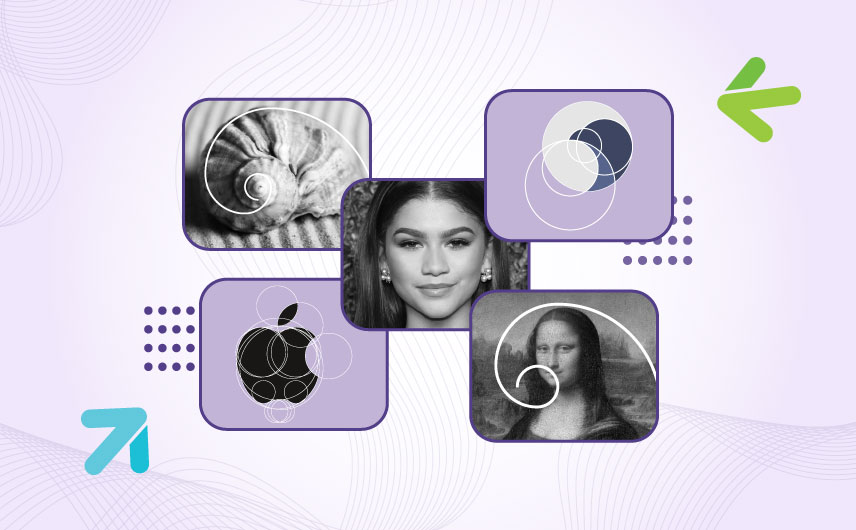
The reason this number gets such high celebratory status is that the golden ratio is found all over nature. From seeds to flower petals, galaxies to hurricanes, and the human body to our DNA structure, things are created in proportions that all follow the golden ratio extremely closely. If you’re coming to it unprepared, you’ll be taken aback by the absolute symmetry and precision that follows the golden ratio.


For example, did you know that the human body, in its diverse variety, follows the golden proportion when averaged out?
The ratio of the length of an average human hand with the combined length of the hand and the forearm is about 1.618. It’s the same thing with the length of the arms and legs divided by the length of the torso. And so it goes for the rest of the human body and even our skull and internal structures.
The golden ratio is a number so precisely proportioned that artists have believed for centuries it reflects the most perfect beauty.

Perfection here denotes symmetry because that’s exactly what the golden ratio brings to the table.
At its core, the golden ratio is about balance, symmetry, and harmony. Fashion and beauty magazines often do quick studies of celebrity faces to determine who has the closest proximity to the golden ratio. In one such study, Zendaya, Beyonce, and Bella Hadid were the few celebrities who popped up as having the most proportioned and symmetrical faces.


The Fibonacci Sequence and the Golden Ratio
We’ve talked about the math behind the golden ratio and several different names given to this unique equation. But we left one of them out, which is ‘the golden spiral’.
As graphic designers and logo designers, we routinely come to the golden spiral to guide our layouts and design directions. But what does the Fibonacci sequence and the golden ratio have in common?
The golden ratio spiral is based on the Fibonacci sequence, a pattern of numbers where each number is a sum of its preceding two numbers. Looking something like this:
1, 1, 2, 3, 5, 8, 13, 21, 34, 55, 89, 144, . . .
If you notice, as you divide each number with the one right behind it, you start to get closer to the golden ratio as the numbers in the sequence get higher.
- 1/1 = 1.0000
- 2/1 = 2.0000
- 3/2 = 1.5000
- 5/3 = 1.6667
And so on.
Fun Fact: Leonardo Fibonacci discovered the numbering sequence when calculating the optimum population of rabbits in a year!
How does the spiral come into the picture?
Take the Fibonacci numbers and turn them into squares. Lay these squares side by side to start creating rectangles. Make sure each is in a proportion of 1:1.618 you know, the golden ratio.

Now form an arch starting from one corner of the rectangle to the other and repeat this process throughout the shape.

And there’s your spiral. This spiral, along with the letter phi φ, are popular representations of the golden ratio in art and design.
Put the spiral over graphic design layouts, website layouts, and logo designs to create works that are harmonious, balanced, and beautifully symmetrical.
Golden ratio out in the wild
For thousands of years, the golden ratio has been considered a reflection of natural beauty, balance, and perfect proportions.
Euclid first talked about it in his work Elements. Phythogras explored how it worked in geometry. Architects believe that the Parthenon and the Pyramids of Giza are designed following the divine proportion. Renaissance artists hailed it as the epitome of the most harmonious, ideal beauty. They created sculptures, paintings, and other works of art following the rules of the golden proportion.
Today, we have designers learning about it in design classes and creative agencies designing logos for multimillion-dollar brands — Apple and Pepsi, for example — using the principles of the Golden Mean.
Take a look at how it appears in nature, architecture, and design.
• Golden ratio in nature
Human beings are hard-wired to feel attraction towards symmetry and order. Have you ever seen videos of people who are chasing hurricanes? You may question their decision-making but it’s almost impossible to deny the impeccable formation of a hurricane — the precise spiral it forms and the way it builds it as it moves.
It’s the same symmetry that pulls at us when we see sunflower seeds in that complicated but exquisite spiral formation. Spiral galaxies, ferns, and seashells too attract our focus and awe — all because of the golden ratio at work.
• Golden ratio in architecture
The ancient Greek temple of the Parthenon and the Pyramids of Giza, in Egypt, are given as two famous examples of the use of the golden ratio in architecture.
While there is skepticism about the intentional use of the golden ratio in the building of these structures, the fact remains that both these structures do appear to follow the golden ratio quite closely in their architecture and design.
• Golden ratio in arts
Leonardo Da Vinci’s Mona Lisa is a famous painting believed to have been created with the golden ratio in the artist’s mind.

While Da Vinci never declared that he used this principle in this painting, we know that he was a close friend of Luca Pacioli, the famed Italian mathematician who wrote Divina Proportione (Divine Proportion), a three-volume discourse on the golden ratio, for which Da Vinci provided illustrations.
So does he say that he used the golden section for Mona Lisa? No. But do we think he did? Hells yeah.
Salvador Dali, on the other hand, was a master surrealist who made intentional use of the golden ratio when setting the dimensions of his Sacrament of the Last Supper.

• Golden ratio in web design
Remember the golden rectangle we talked about a few scrolls up? In web design, that comes in handy as you have to divide the sections in a way that aids reading, comprehension, and even skimming.
The golden ratio helps us break up the perfect rectangle (where its length is 1.618 times its width) into two sections — the large one for the main content and a sidebar for additional details and social media links.

Forbes, a prominent business website uses the same approach to divide its content into two, facilitating readership for their users.
• Golden ratio in logo design
The Apple logo is often cited as the most prominent example of the golden ratio in logo design. But it’s simply not true. Thank the design gods that the Apple logo is made with instinctual harmony and not geometric precision. If it had, it would look something like this:
Not exactly the precise beauty we know.
On the other hand, we do have the Pepsi logo that nobody loves, but an insane amount of maths and geometry has gone into its construction. This proves the point that designers know and are always taught: If it looks right, it is right.
Meaning, no need to go into minute mathematical adjustments as tiny flaws and imperfections look more natural to us than exact measurements.
But does that mean that there is no place for the golden ratio in logo design?
There is, but not at the cost of natural and gut-driven harmony.
The National Geographic logo, for example, uses the golden rectangle but that’s because the shape of the logo supports the inclusion of the ratio-based rectangle — not the other way around.
How is the golden ratio typically used in logo design?
An expert designer can utilize the golden ratio for various parts and processes of a logo design. A few of them are listed below:
– To balance the shapes
If you are going to use multiple geometric shapes — circle, rectangle, square, triangle, etc. — in your logo design, one way to ensure harmonious proportions is to balance them with the golden ratio.
Make sure that each shape is perfectly placed with the others, in proper sizing, dimensions, and placements, so when you look at the whole, there is harmony and balance in the design.
– To guide the eye
Composing your logo design is as critical to its overall look as choosing the right individual elements. You have to make sure that elements are placed in a way that supports a natural but intentional hierarchy — the key elements must stand out against the secondary information.

With the golden ratio grid guiding you, you can create a strong focal point for your logo. It will help you attract the eye and guide it through the design in the most natural, satisfying, and helpful progression.
– To inform inter-elemental proportions
Another way the golden ratio can come to the rescue of your logo design is by giving it the most proportionate sizing and dimensions. The golden ratio can help you figure out the best height and width relationship for your logo design.
You can also use the golden ratio to realize the proportions for your strokes. Both for the typography and icons. Remember that keeping the strokes different for different letters — at least slightly — is essential to create a natural look. Don’t sacrifice a natural look on the altar of the golden ratio rigidity.
Let your design tell you if it needs the golden ratio framework.
– To determine the size and spacing of your typography
The ratio between the main heading (brand name) and secondary text (tagline etc) must be balanced. One way to ensure that is to utilize the golden mean for your type size and spacing.
Graphic designers and UX designers regularly consult the golden ratio to help determine heading and body text size for websites, poster design, and more.
If you are going to use more than one text field for your logo — like a tagline in addition to the brand name — the golden ratio can help you figure out the balance more easily.
– To add precise attention to detail
Lastly, even if you haven’t used the golden ratio grid in the initial process of the design, conclude it with the golden mean as your guide.
A stroke looks too broad and clunky? Let the golden ratio help you figure out a better size. Want to tilt a letter a certain way? Use the golden ratio to learn which would be the best angle. From font pairings to deciding the perfect alignment for your elements, the golden ratio can prove a helpful guide to achieving symmetry in your logo design.
Maximize your logo appeal with the golden ratio
As designers, we are always looking for the next great detail to make our designs stand out. Using the symmetry and perfect proportions promised by the golden ratio, we have a great tool at our disposal.
Use it to guide your logo design composition, alignment, hierarchy, and layout.
But don’t force it upon your designs.
Break through the design noise with purpose and meaning behind all your decision-making and supercharge it with the golden ratio guiding, not forcing you.